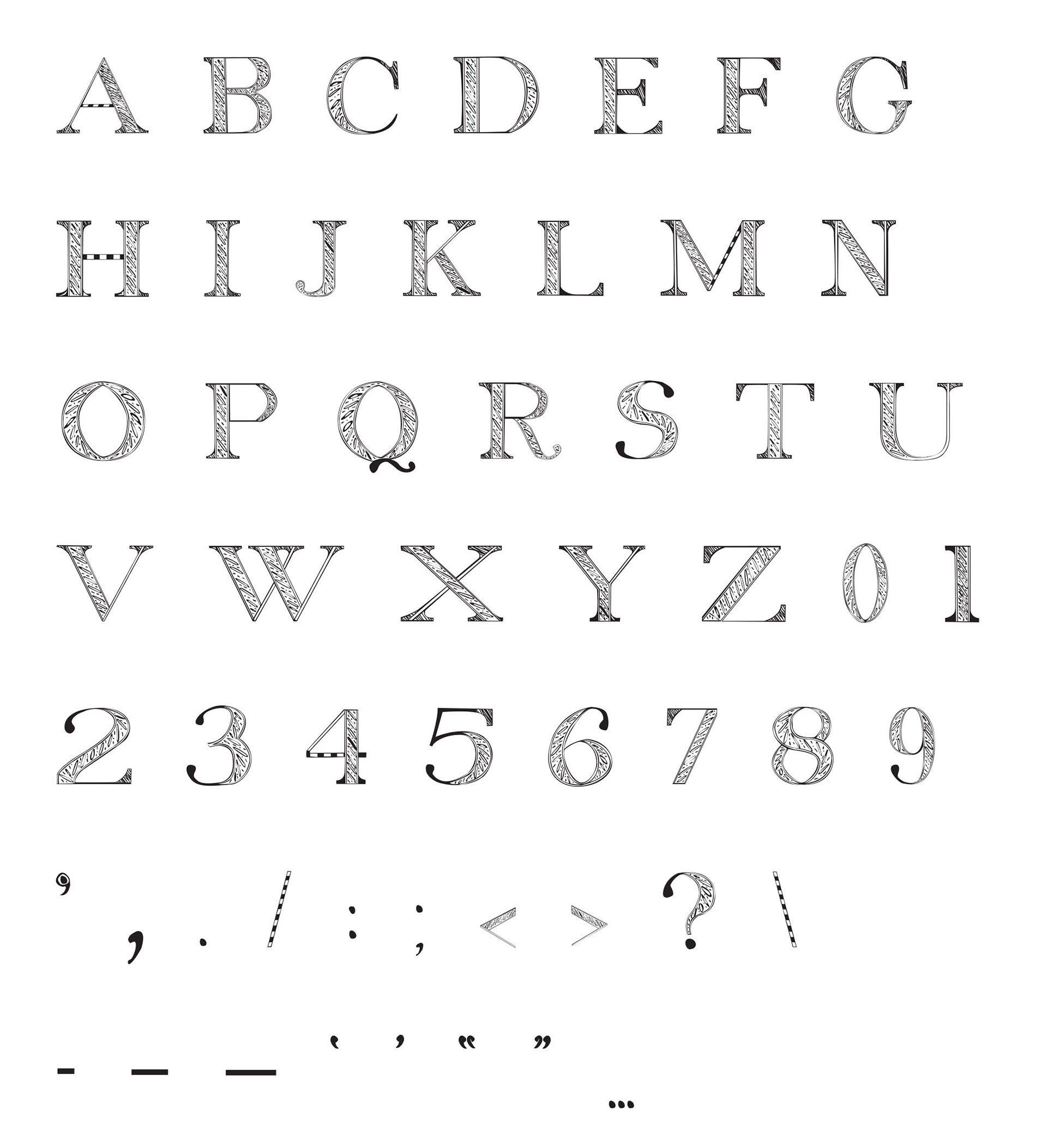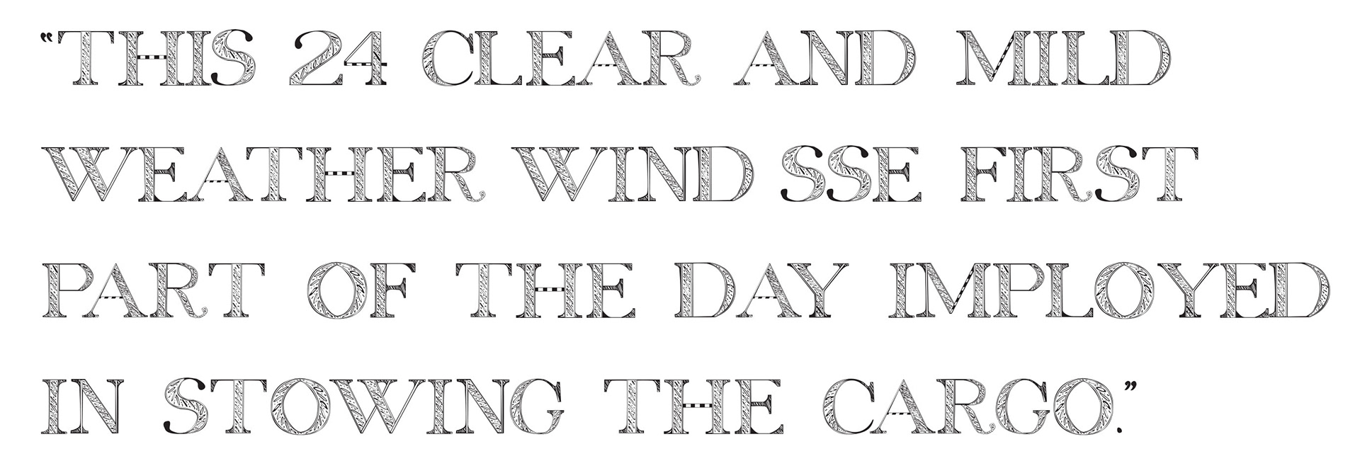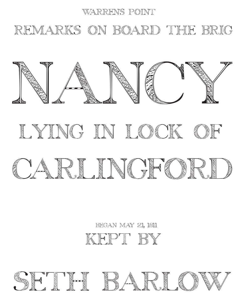
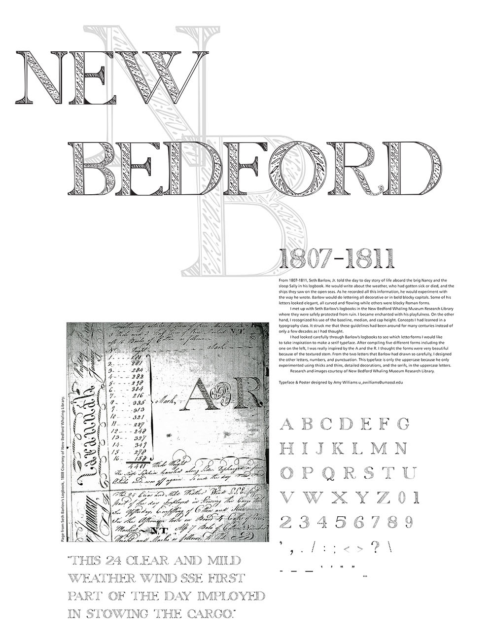
The typeface is based off of the log pages of Seth Barlow aboard the Brig Nancy. This is one of two typefaces that I have created based on his writing. I was really inspired by the A and R that are in the photo above. I thought the letterforms were very beautiful because of the textured stem. From the two letters that Barlow had drawn so carefully, I designed the other letters, numbers, and punctuation. This typeface is only the uppercase because he only experimented using thicks and thins, detailed decorations, and the serifs, in the uppercase letters.