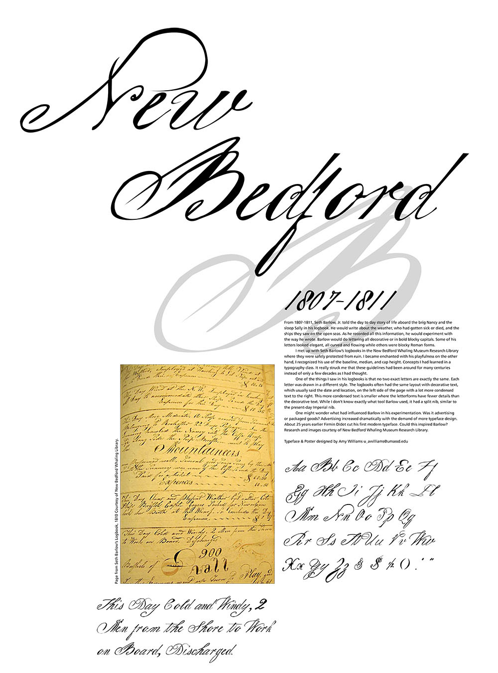
From 1807-1811, Seth Barlow, Jr. told the day to day story of life aboard the brig Nancy and the
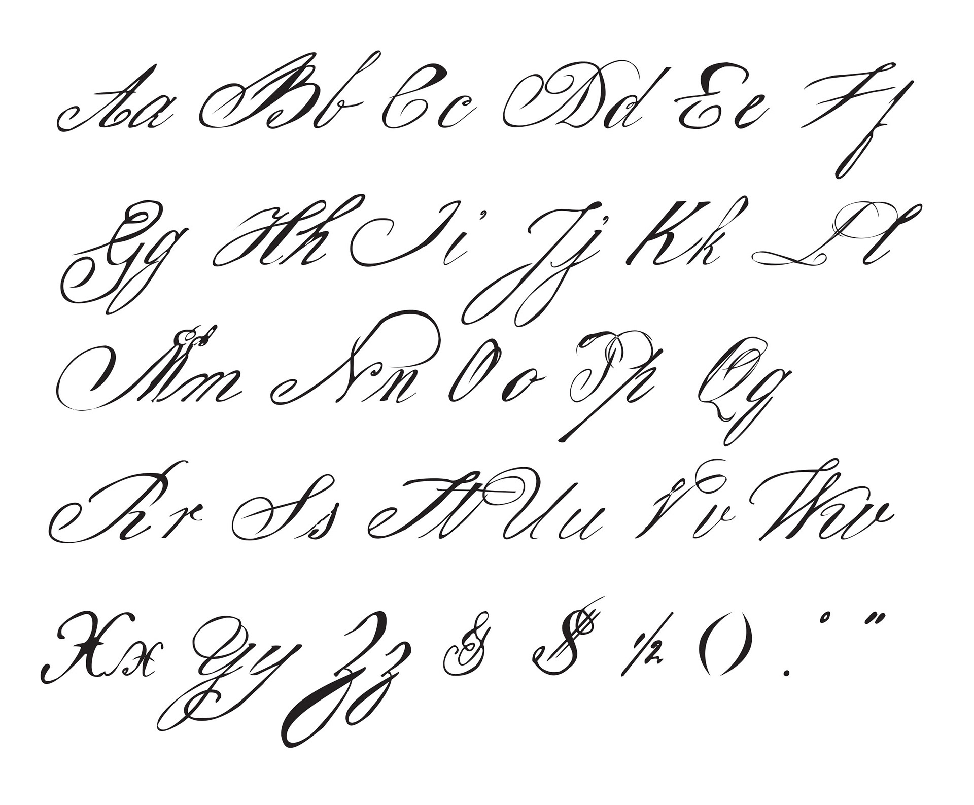
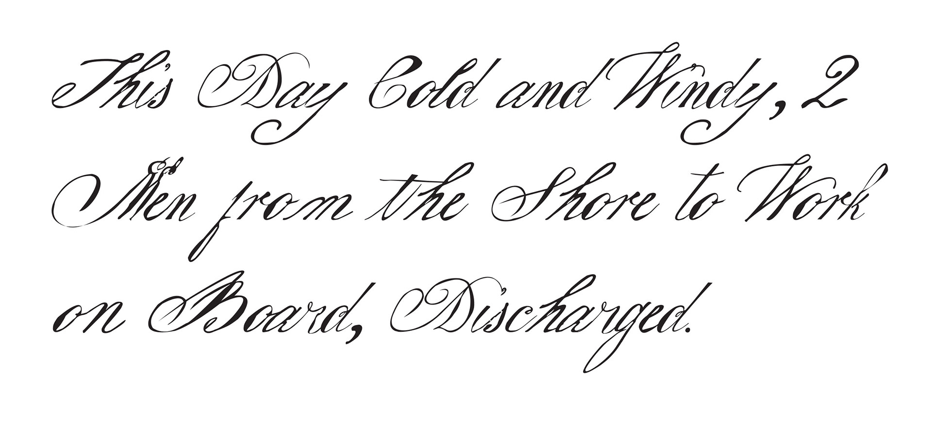
sloop Sally in his logbook. He would write about the weather, who had gotten sick or died, and the ships they saw on the open seas. As he recorded all this information, he would experiment with the way he wrote. Barlow would do lettering all decorative or in bold blocky capitals. Some of his letters looked elegant, all curved and flowing while others were blocky Roman forms.
I met up with Seth Barlow’s logbooks in the New Bedford Whaling Museum Research Library where they were safely protected from ruin. I became enchanted with his playfulness on the other hand, I recognized his use of the baseline, median, and cap height. Concepts I had learned in a typography class. It really struck me that these guidelines had been around for many centuries instead of only a few decades as I had thought.
One of the things I saw in his logbooks is that no two exact letters are exactly the same. Eachletter was drawn in a different style. The logbooks often had the same layout with decorative text, which usually said the date and location, on the left side of the page with a lot more condensed text to the right. This more condensed text is smaller where the letterforms have fewer details than the decorative text. While I don’t know exactly what tool Barlow used, it had a split nib, similar to the present-day Imperial nib.
One might wonder what had influenced Barlow in his experimentation. Was it advertising or packaged goods? Advertising increased dramatically with the demand of more typeface design. About 25 years earlier Firmin Didot cut his first modern typeface. Could this inspired Barlow?
Research and images courtesy of New Bedford Whaling Museum Research Library.
After I designed the typeface, a poster was created to display the typeface.